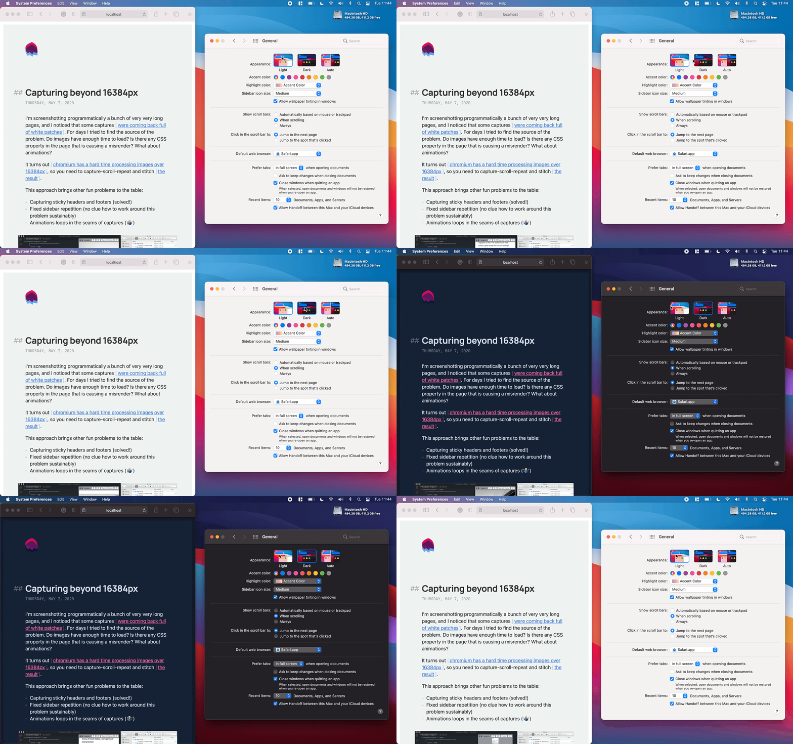
Light/Dark mode, the CSS-variable way

Choosing colors is hard. Adapting the color mode of your website to your users' preferences is (it should) not.
For this deceivingly short recipe, you will need a couple of ingredients: CSS variables and the media feature prefers-color-scheme.
- You can define your color variables and their values for light (default) and dark modes in your CSS file:
:root {
  --text: #333333;
}

@media (prefers-color-scheme: dark) {
  :root {
    --text: #ffffff;
  }
}
- Then you can use those variables in your CSS declarations:
element {
  color: var(--text);
}
- And that's it! Your website will react to the user's color theme preference.
You can play with a simple but functional example in this Codepen; fidget with your OS appearance preferences to see colors change. This foundation also works like a charm in more complex scenarios:
- Check Joshua Comeau's post. He implements light/dark mode in Gatsby using CSS variables.
- Or this example using CSS variables with next.js and styled-components.